Onboarding experience
for first-timer Users
New users were leaving without even finishing the onboarding process. Focus Bear was losing 80% of new sign-ups before they even started using the app. I led the end-to-end redesign of the onboarding process and created a visually pleasing, easy to follow structure and concise language. The new user flow resulted in a 50% reduction of drop-offs during onboarding.
Overview
SaaS Product
Web App
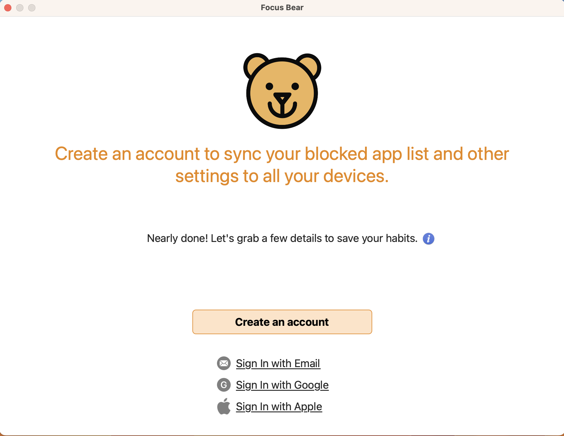
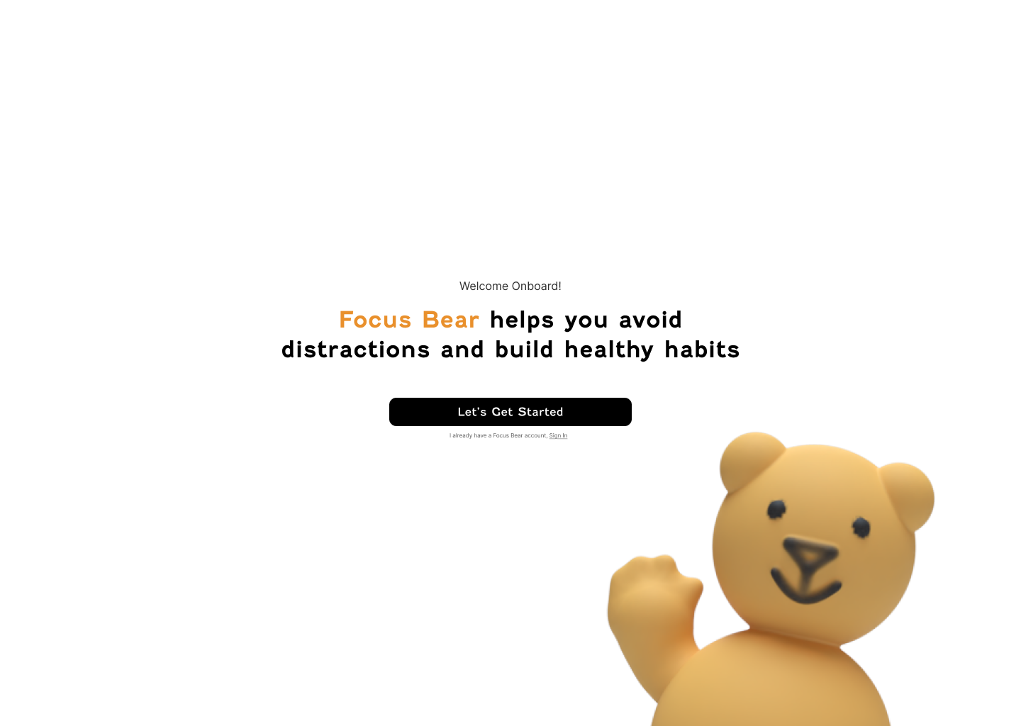
Sign In
Sign Up
Onboarding
Skills
User Interview
User Research
End-to-end Design
Workshop Facilitation
Cross-functional collaboration
Timeline
November 2024- April 2025
Tools
Figma
Summary
Focus Bear is a productivity startup helping neurodivergent users stay on task through mindful routines and distraction blocking. At the time, the product team consisted of a founder, five developers, three product designers, and one project manager.
As the only designer with formal UI skills, I worked end-to-end on the web onboarding redesign, from research and user interviews to wireframes, prototyping, testing, and final UI. The project ran over four months (two days per week).
Goals and Initiatives
Business Goals
- Reduce user drop-off during onboarding
- Improve completion rates and activation
- Clarify product value and help users set up core functions (habits, distractions, focus sessions)
User Goals
- Make setup faster and less overwhelming
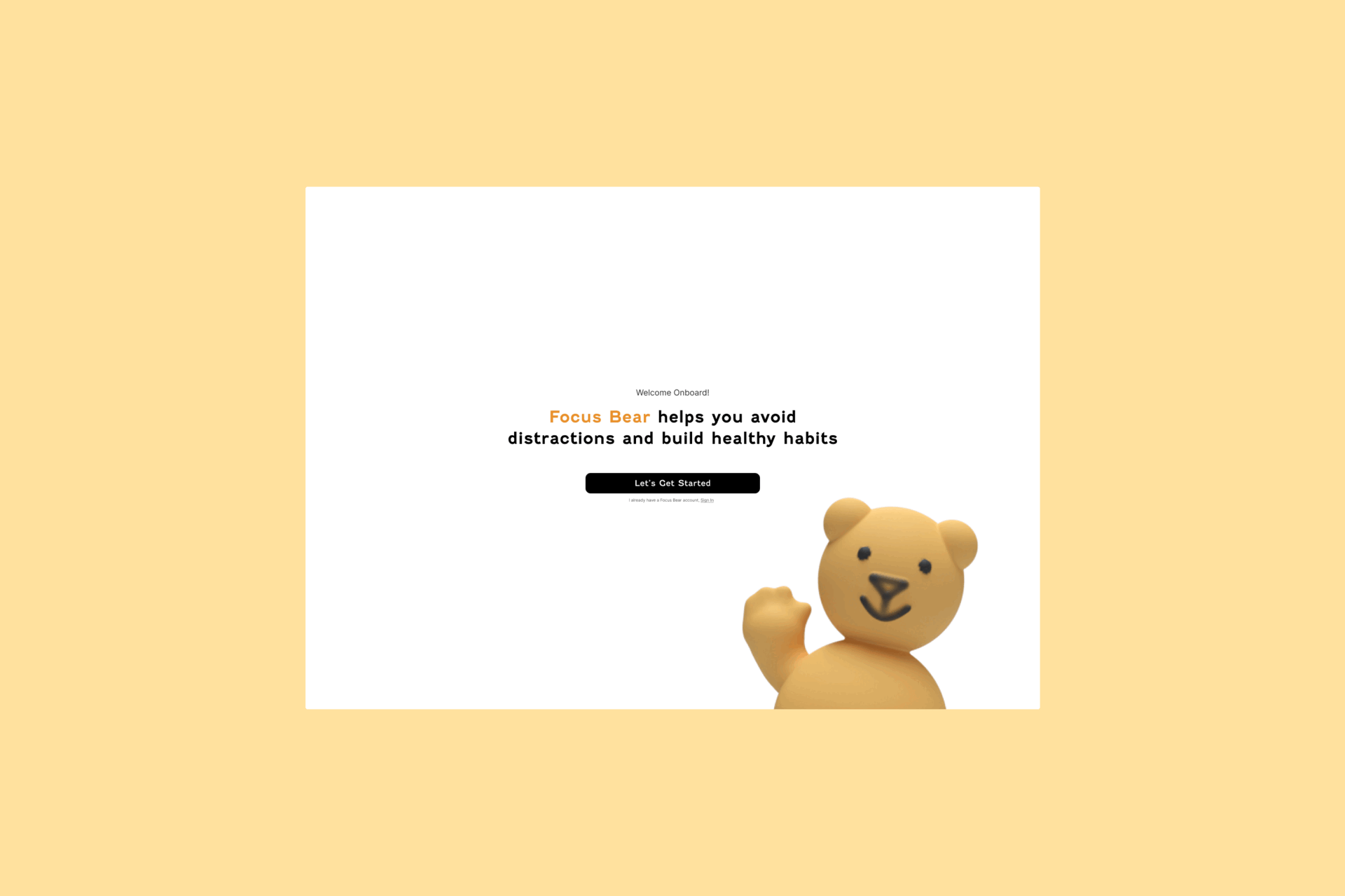
- Provide a clear, welcoming introduction to the app
- Enable partial setup flexibility without losing progress
Problems
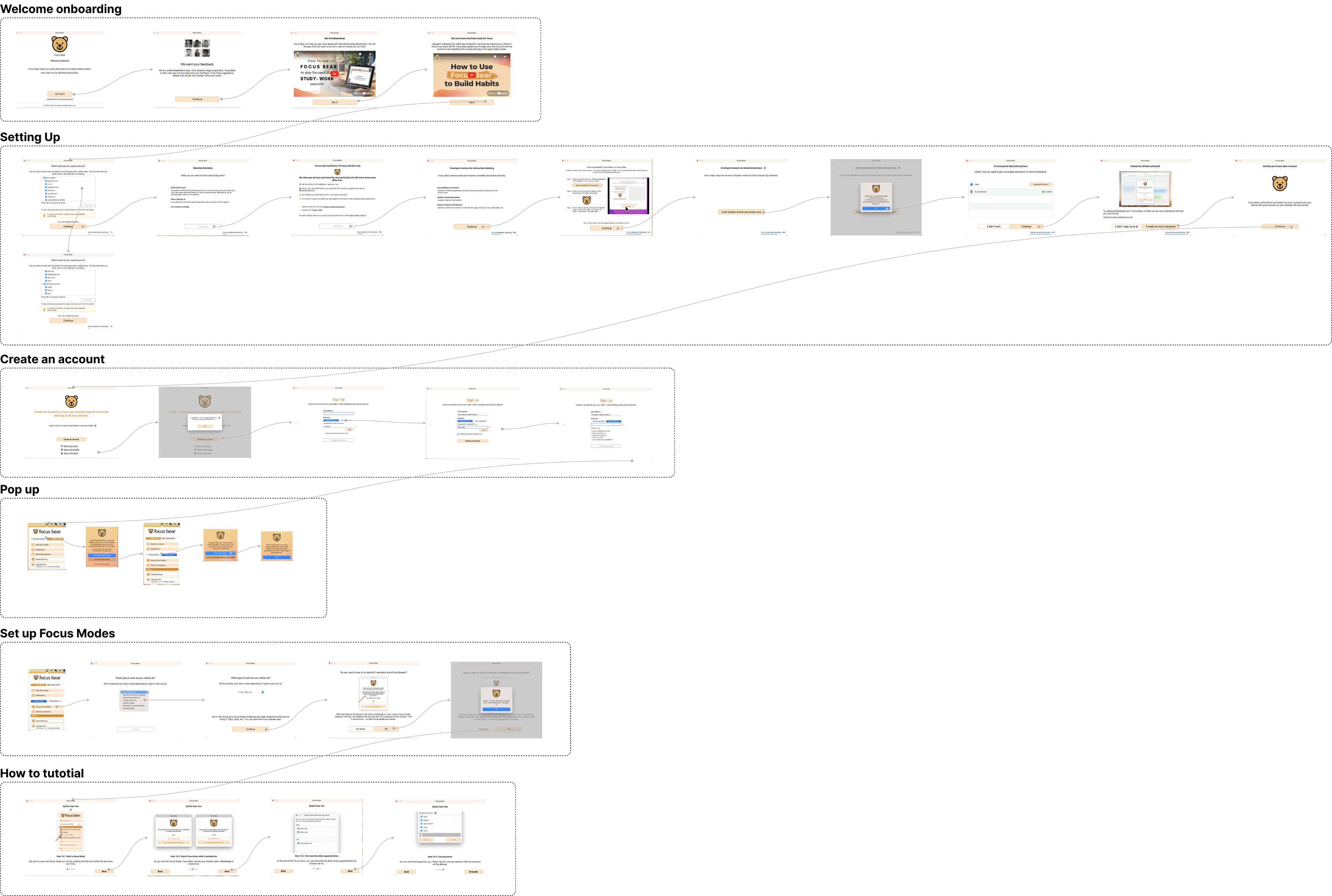
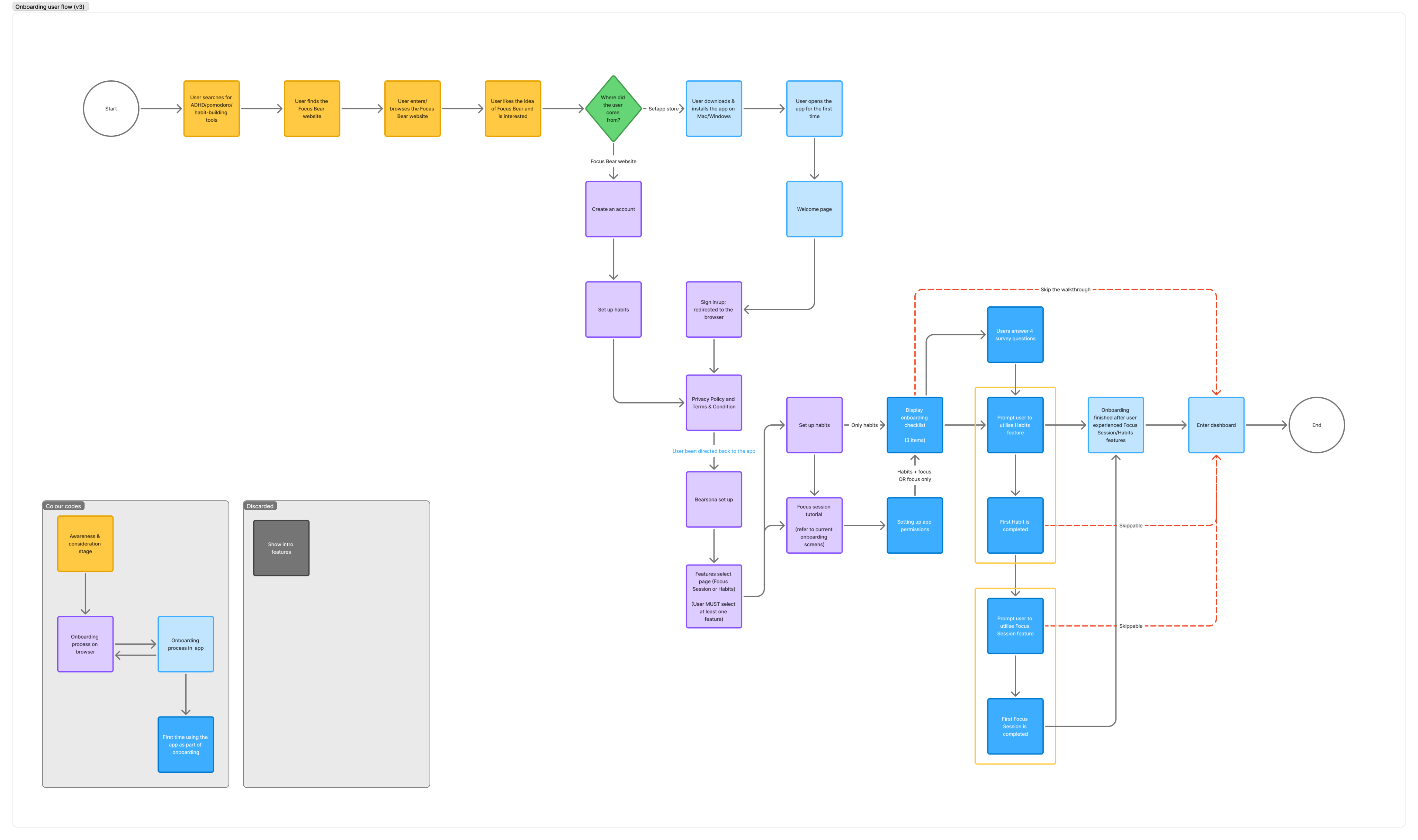
- 32 screens spread across 3 screen sizes and various anchor points
Overly long and inconsistent flow creating inconsistent layouts and visual fatigue
- Skip function logic flaw
Clicking “Skip” on any screen bypassed the entire onboarding process.
- Visual clutter
Some screens contained up to nine interface elements, including multiple CTAs, gifs, body text, and disclaimers, creating confusion and cognitive overload.
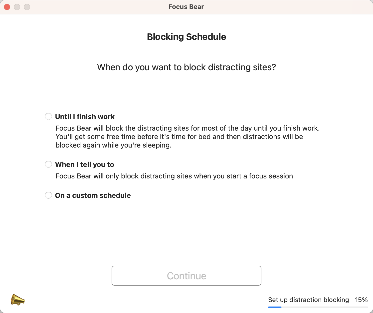
- Unclear copywriting
UX writing was verbose and ambiguous. For example, pages titled “Which sites do you waste time on?” or “Blocking Schedule” included lengthy, uneven descriptions that made it unclear how each option functioned.
Impact:
Analytics from November 2024 showed that out of 120 new users, 80% didn’t complete onboarding.
- 15 dropped off at the welcome screen
- 24 stopped at the permissions stage
- 12 quit during sign-up
- 32 abandoned setup mid-way
Key Insights
Over-explained instructions caused disengagement, clarity and flow matters.
Flexible skipping and visible progress indicators increased motivation to continue.
Users preferred playful tone and visual clarity over humour-heavy text.
Technical Constraints
- Inconsistent screen dimensions on macOS due to window scaling and unaligned anchor points.
- Developer team confirmed that standardising screen sizes would require major backend refactoring.
- As a workaround, I reordered and reduced screens, simplified transitions, and later proposed redirecting sign-up and survey steps to the browser, similar to Figma’s approach, reducing complexity and dev effort.
- Due to limited capacity, only one platform (web) was prioritised.
Design Response
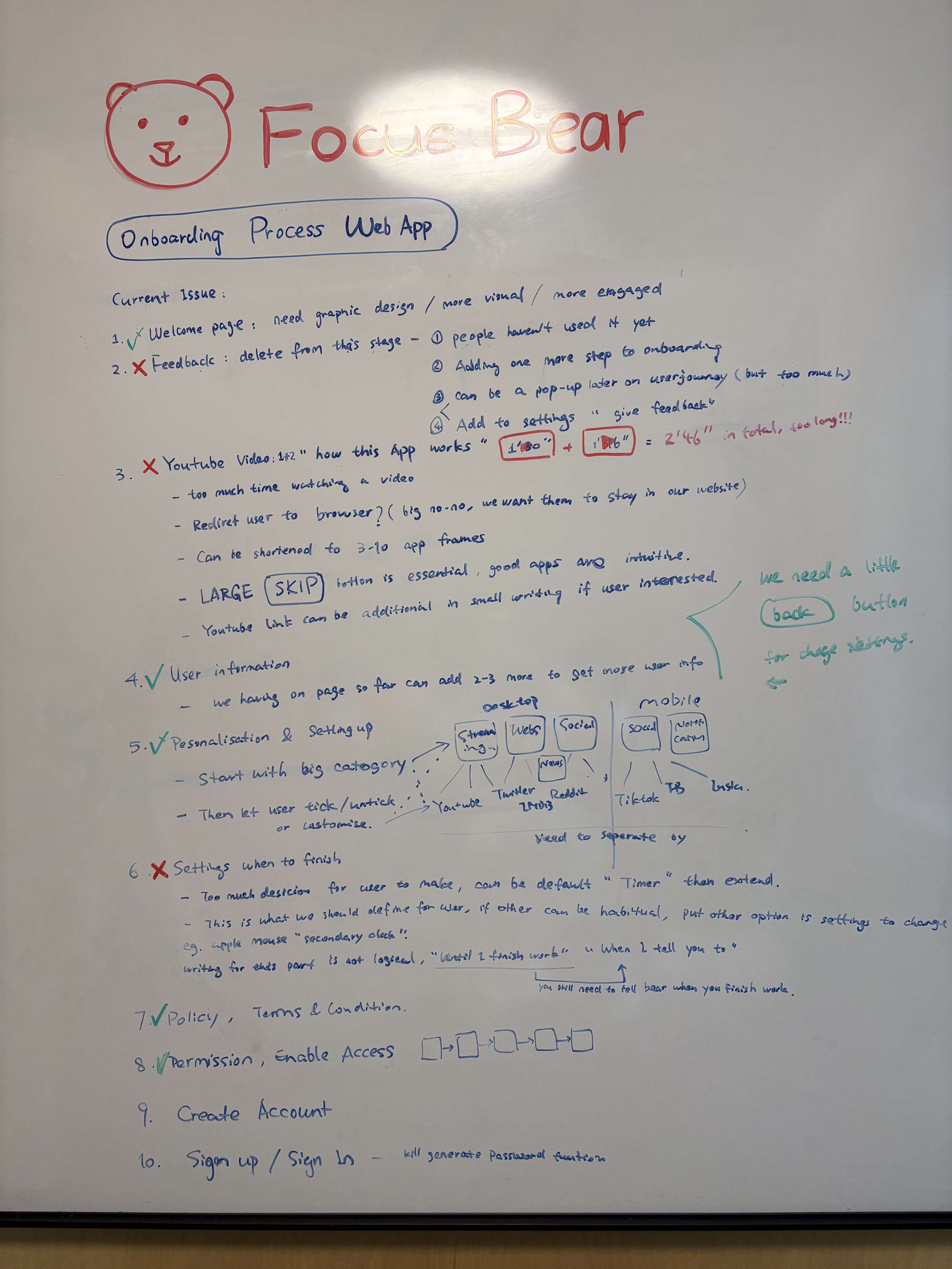
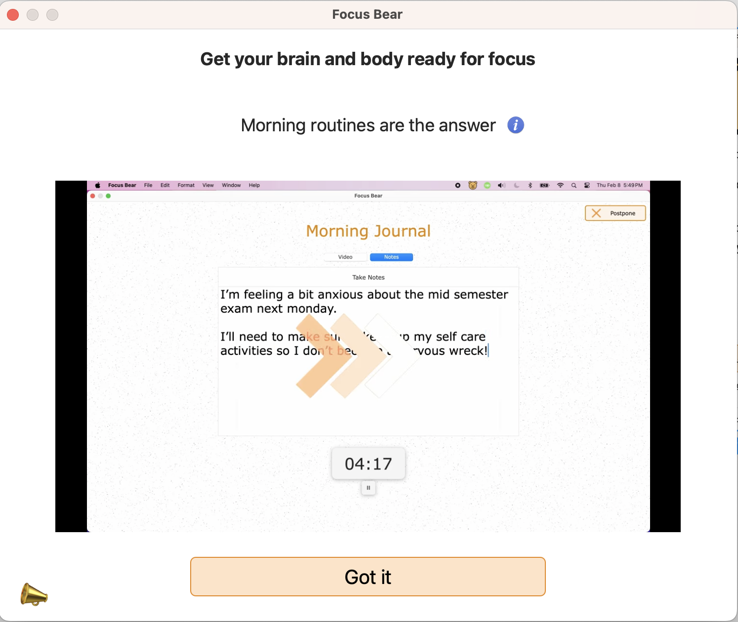
Cut off unnecessary steps
- Removed video tutorials
- Removed redundant feedback page right after welcome.
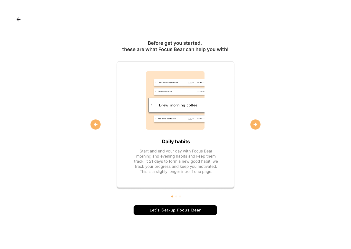
- Consolidated three video explainers into a carousel of visual cards for faster comprehension.
- Reduced flow from 32 to 18 screens, with logical grouping by setup stage.
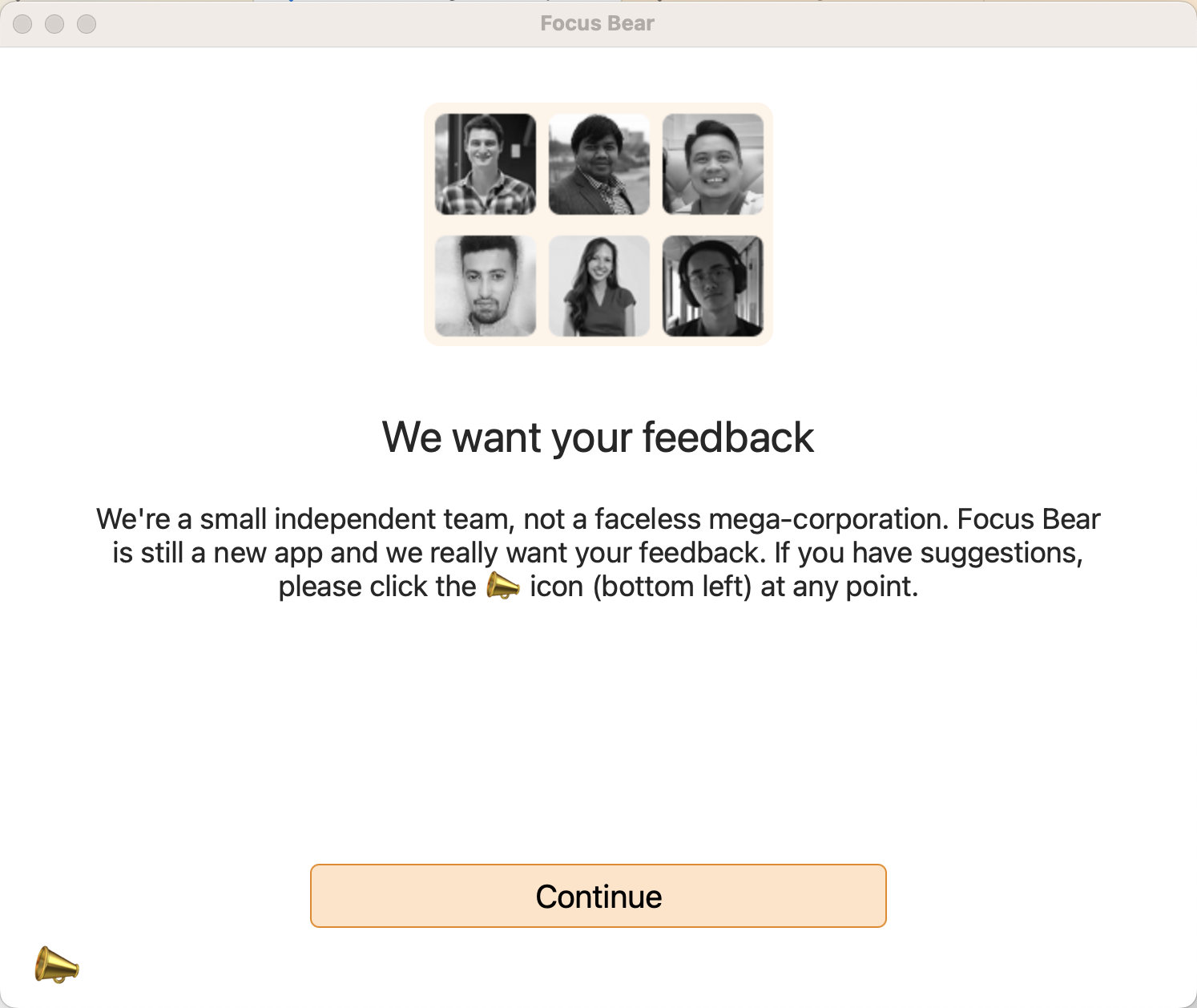
It is not the timing ask for feedbacks yet, it only added cognitive overload at this stage.

Feedbacks
We are designing an intuitive app, not Adobe Photoshop, we offering a skippable walk through within the function page instead of the previous video tutorial.

Video Tutorials
Customise is good, but we don’t want users feel frustrated with endless settings, I recommended the default modes.

Endless Settings
Information Architect: Contextual skip
- Introduced contextual skipping, allowing users to skip optional sections (like surveys) while retaining core setup progress.
Redesigned Visual
- Established a consistent layout system using auto-layout and card-based structure.
- Replaced decorative “Fenwick” font with Inter, a more legible digital typeface.
- Updated buttons from low-contrast orange to accessible black with bold CTAs.
- Created reusable spacing and typography standards for future scalability.
Before
After
Before
After
Before
After
Re-write UX language:
- Rewrote onboarding copy for clarity, brevity, and consistency in tone.
- Replaced ambiguous language with clear intent (“Block distractions after work” vs. “Until I finish work”).
- Kept playful tone aligned with brand but removed filler humour and excessive text.
Result
In prototype testing with 12 participants, all users completed onboarding.
(Fastest time: 2 minutes, average 3 minutes, longest 4 minutes 20 seconds.)
All 12 users reported the flow felt “clearer” and “more guided.”
Quantitatively, onboarding drop-off decreased by 50% post-launch (Based on first release with redesigned flow.)
The redesign established the foundation for a unified design system and scalable UI components across Focus Bear’s web app.
Next Project


Focus Bear First Time User Onboarding


Web App
SaaS product
12


Focus Bear Dashboard Redesign


Web App
SaaS product
10
State Library Children
Quarter event booking


Mobile App
11


